Sean McCormick is an up-and-coming photographer, who I met last year. He has been working with a tintype variant and combining it with modern photo techniques.
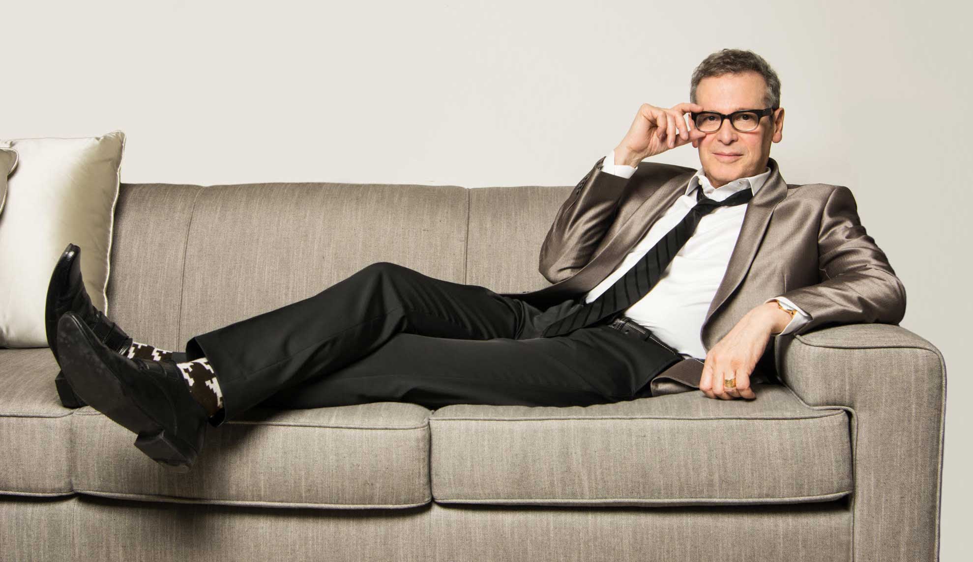
He recently photographed composer Keith Gordon and me and I asked him about his work and his process.

Portraits of composer Keith Gordon and me
BG: Where did you study?
SM: I studied photography in a university fine art environment, rather than a technical photography program. I was a little technically deficient at first, but have now worked with one of the finest commercial photographers in NYC on teams producing campaigns most people have seen.
BG: How did you apply your art training to photography?
SM: From my fine art training, I’ve learned to love some historical photographic mediums and have been working to make them commercially viable blending them with modern technologies while developing my own client base.
BG: How would you describe your approach to portrait photography?
SM: I enjoy working with varied subject matter and especially love portraiture, here showing examples of you and Keith. When I make a portrait, the goal is to transcend the physical appearance of the person and have the viewer see it in a non-rational way. It’s difficult – photography is so representational – a viewer’s first reaction is usually ‘who is that?’ or ‘where was that taken?’. Using black and white and historical photographic media helps communicate more than just visual physical details.
BG: The architectural photographs are stunning, how does your process highlight these shots?
SM: I’ve recently done an architectural project featuring one of the college I attended, UMass at Dartmouth, which was designed by Paul Rudolph known usually for individual buildings done in the Brutalist style, he designed all of the buildings on the campus creating a surreal environment where, at night blanketed in snow, it seemed like you were on the moon at a space station. I thought the tintype would help communicate that feeling.

Buildings designed by Paul Rudolph at the campus of University of Massachusetts Dartmouth. The liberal Arts Building; a free-standing bell tower, the Campanile; the Library.
BG: What other types of clients have been hiring you?
SM: Some of my newer clients are embracing my blending old and new photo mediums and am enjoying partnering with them creatively. I have a leather goods designer for whom I have been photographing their product shots in color and we are planning richer content including images of their products being manufactured in New Jersey and portrait of the owner. Also I have a client who is resurrecting his family’s rye whiskey company. It was shuttered because of Prohibition. I’ve been documenting all the original bottles and related objects, The next step is a visit to the old distillery site in rural PA. And I have been doing quite a bit of interiors design shoots for designers like you.

Whiskey Ad

Red dress by J.W. Anderson; ‘rags’ by Loewe; an orange stripe dress by Louis Vuitton.
BG: Do you have to alter people’s perception of the process?
SM: It is tricky working with the historical processes as viewers tend to associate that look with the late 1800’s, so I’m working hard to shake off that perception. Tintype is just another tool of expression, like a painter choosing to use one kind of brush or a certain treatment of paint. I enjoy working in modern color digital, black and white, historical process and blending them together. I think art school taught me to be flexible in that way.

Rowers On the Charles River.
BG: How do we see more your you work?
SM: My website is www.sean-mccormick.com
BG: Thanks for visiting today. I look forward to our next project together.

Sean McCormick photographed by his friend, Marty Ulmans, commercial photographer.


